Three questions before the paywall got 74% more people to start a free trial
- Outcome
- +73.7% free trial starts
- Scale
- ~53,000 users, two weeks
- My part
- Idea, design, iteration, analysis
- Shipped with
- Truecaller’s User Growth team
Problem
Premium could block spam and summarise calls. People thought it just removed ads.
Truecaller’s research in Latin America found almost no one could name a Premium feature beyond ad removal. The people who did value the rest had mostly found out about it during the research itself.
The value was there. We just weren’t showing it at the right moment.
Where people meet Premium
People meet Premium at the end of onboarding, right after setting the app up.
And Truecaller’s setup is heavy. Verify your number, grant permissions, make a profile. All of it is necessary for caller ID to work. None of it is about you.
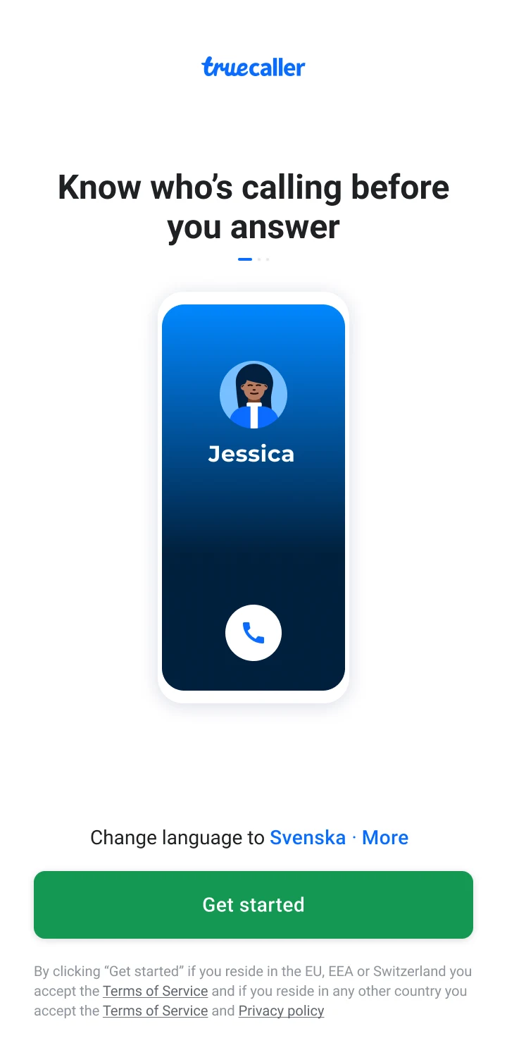
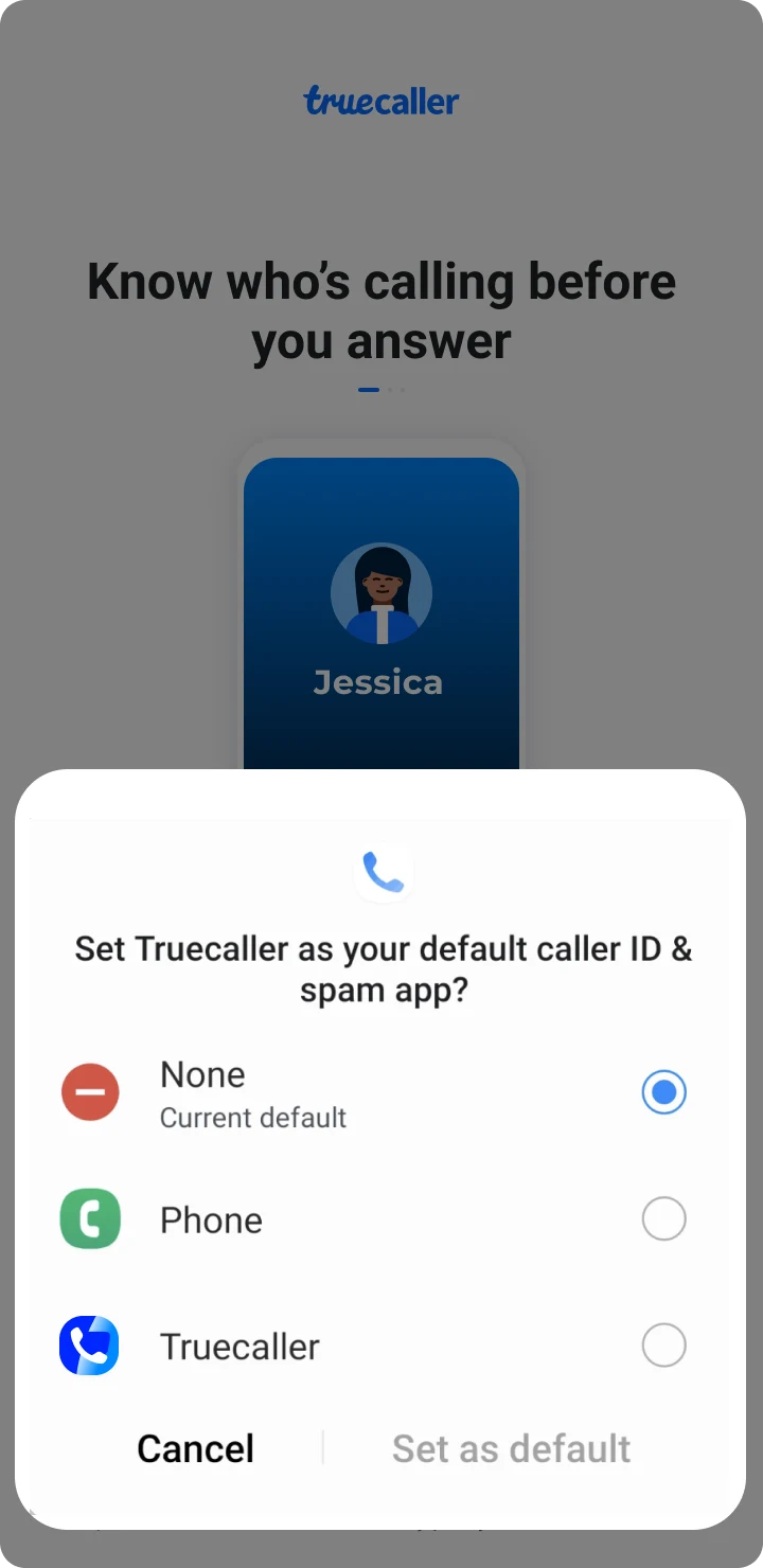
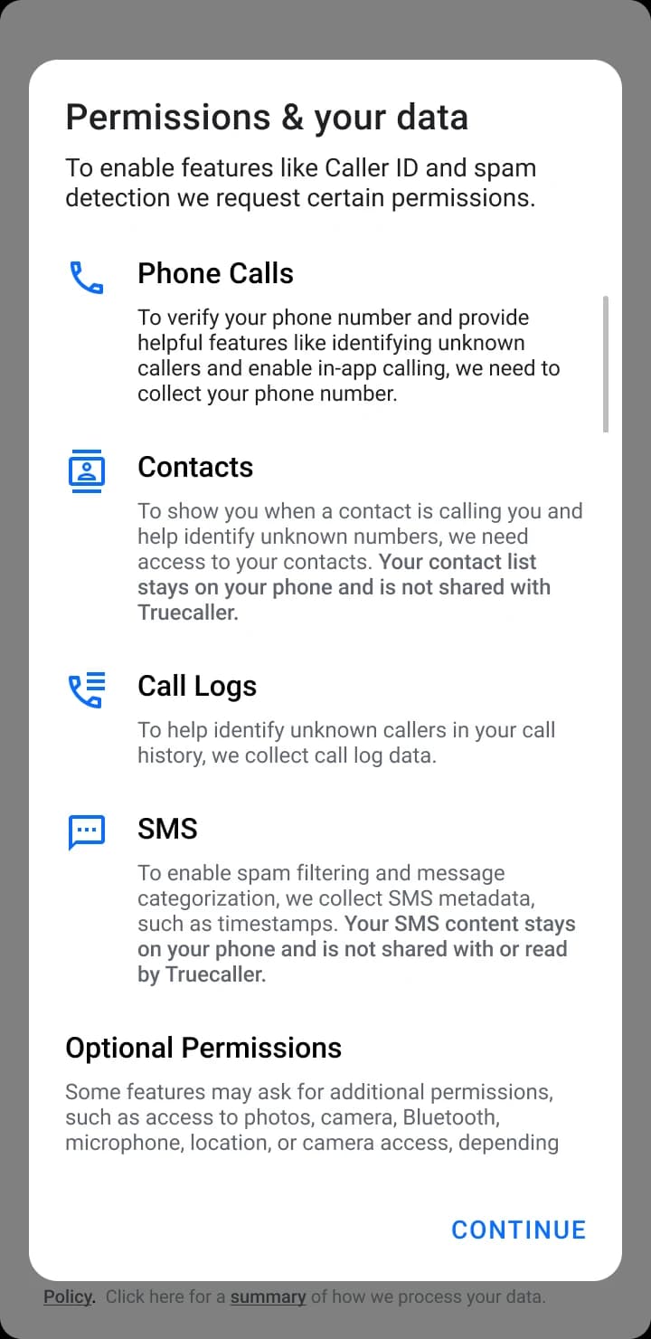
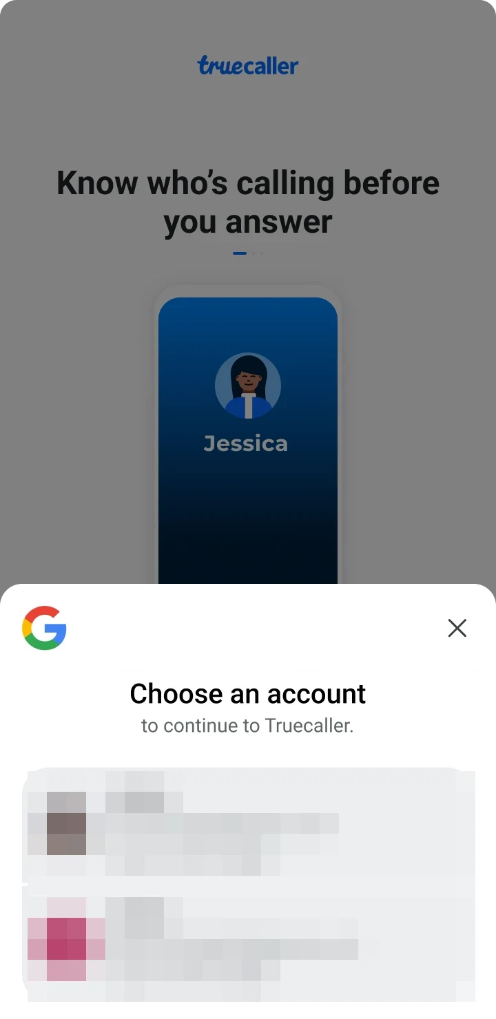
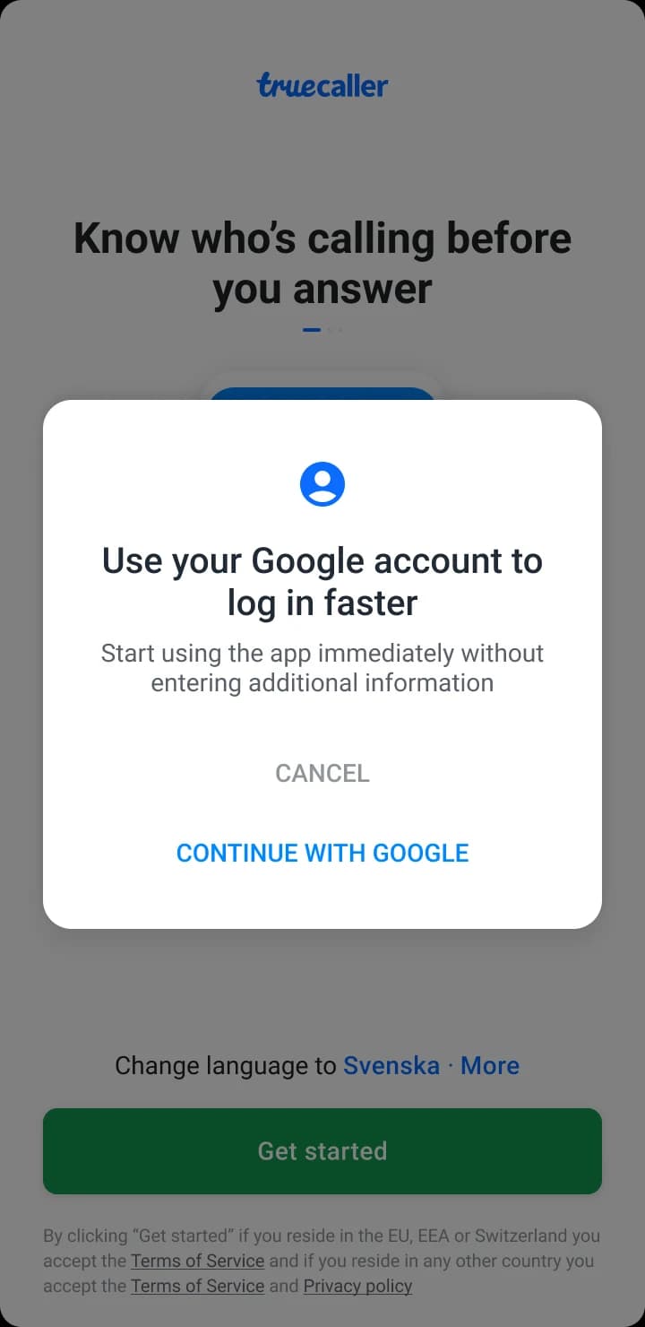
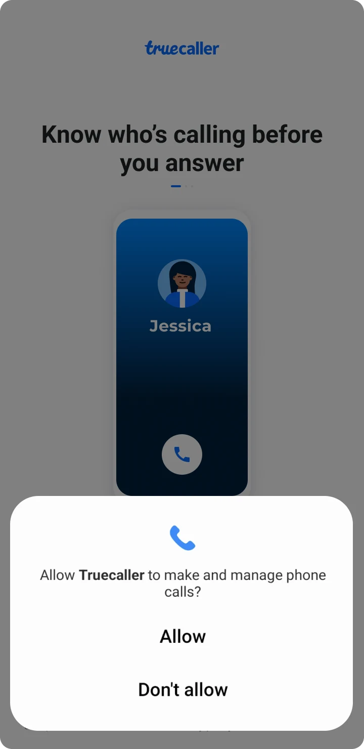
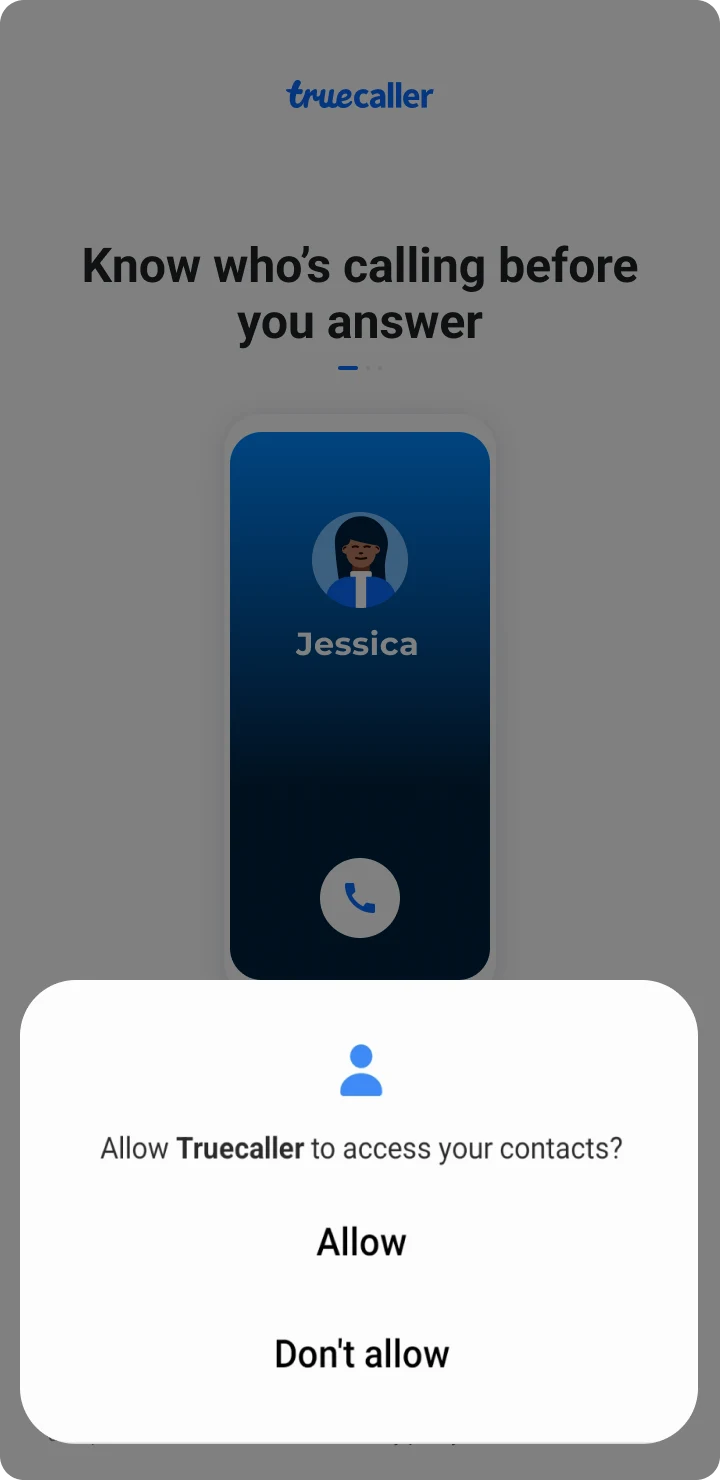
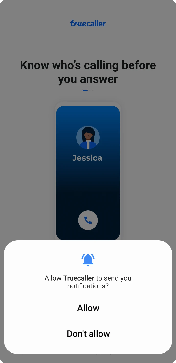
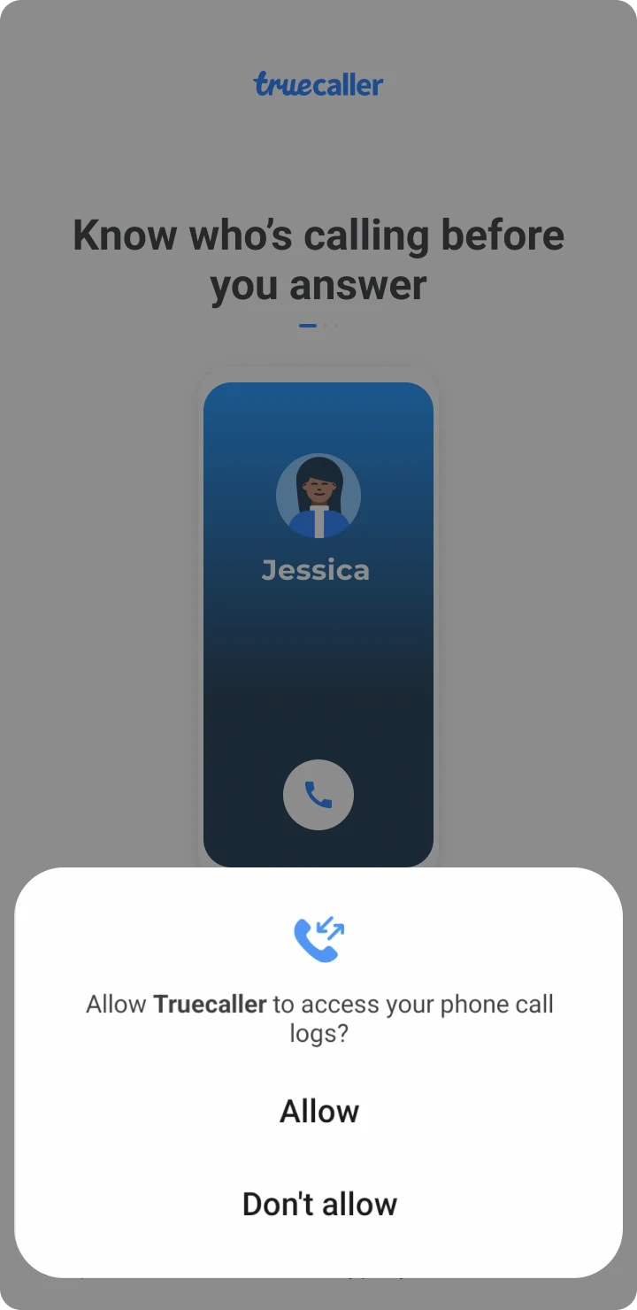
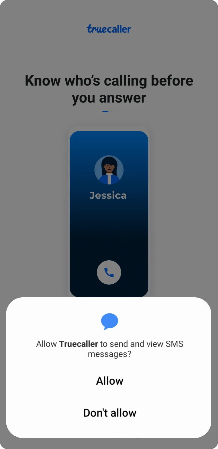
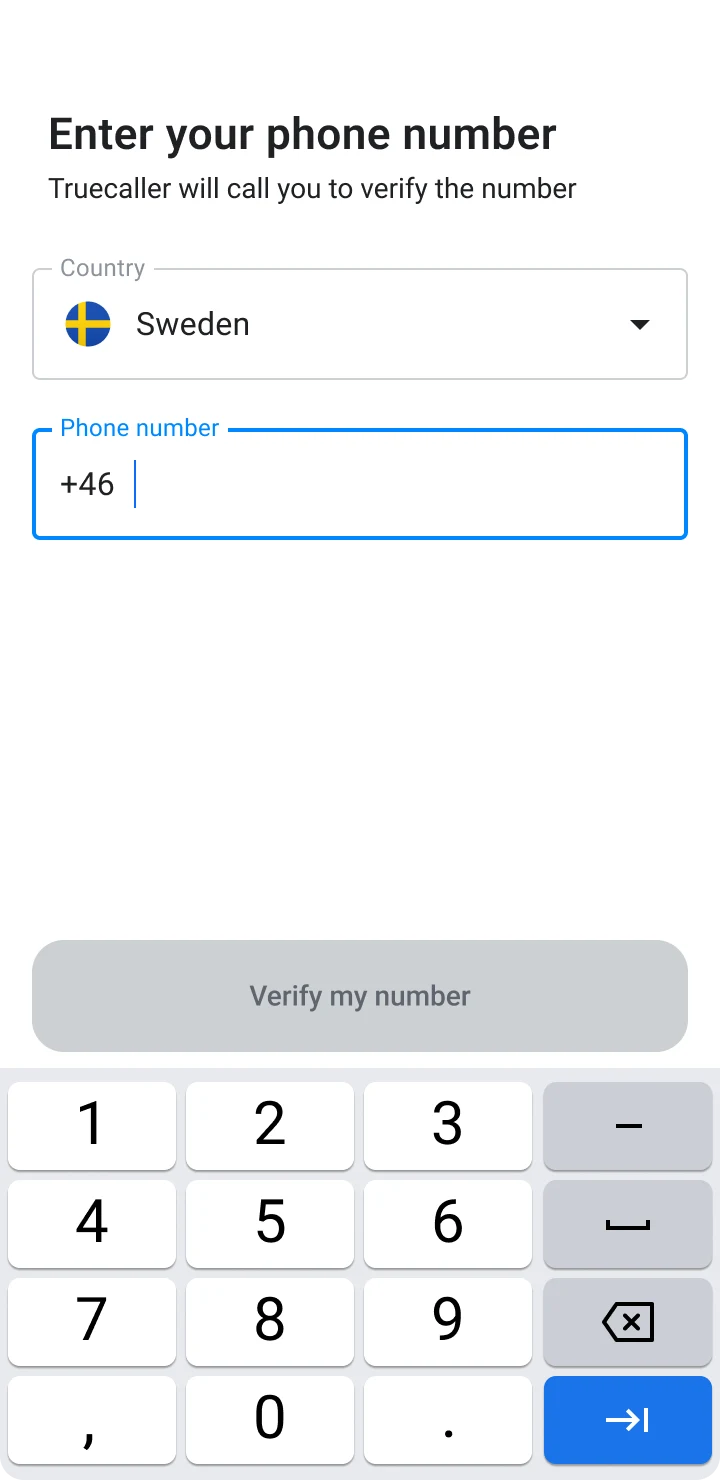
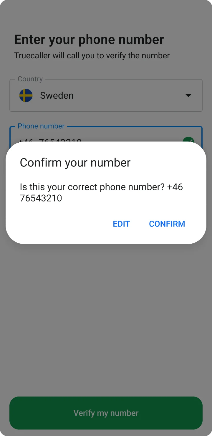
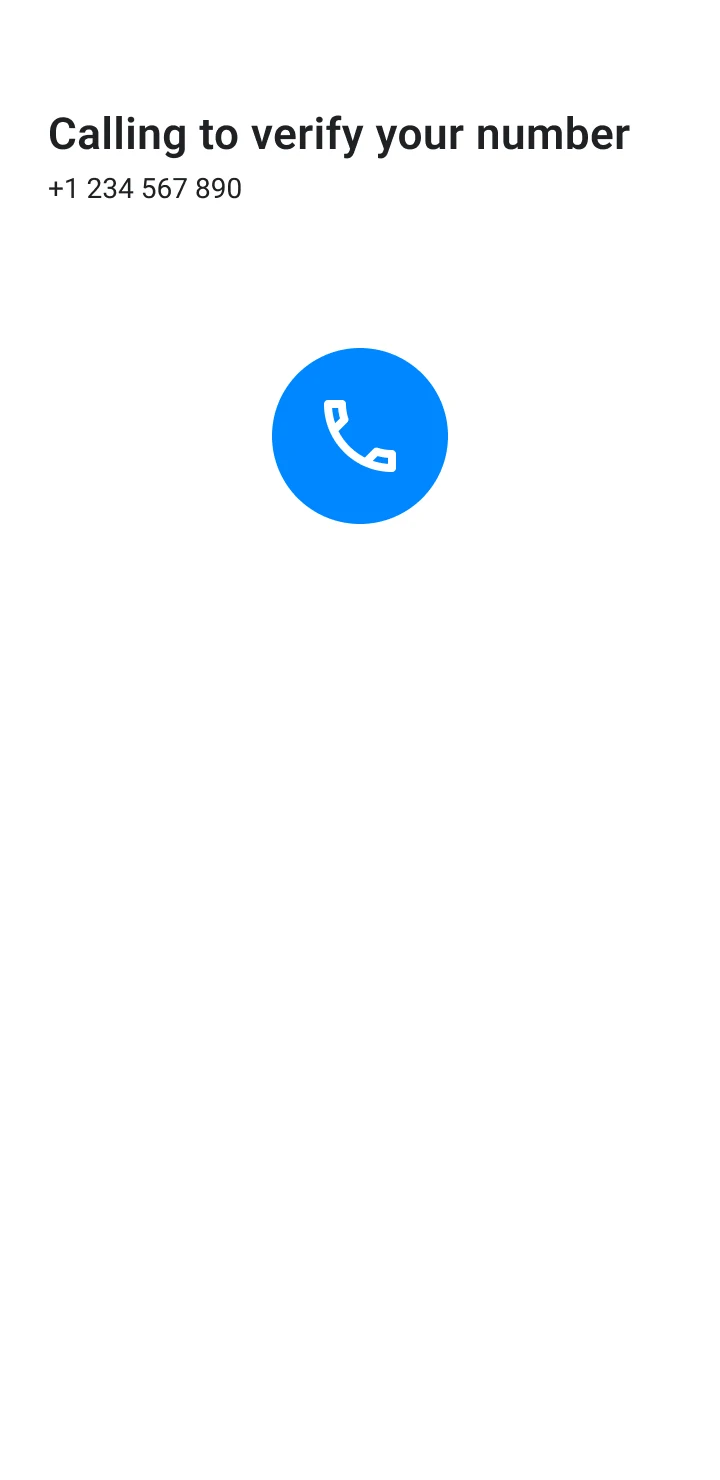
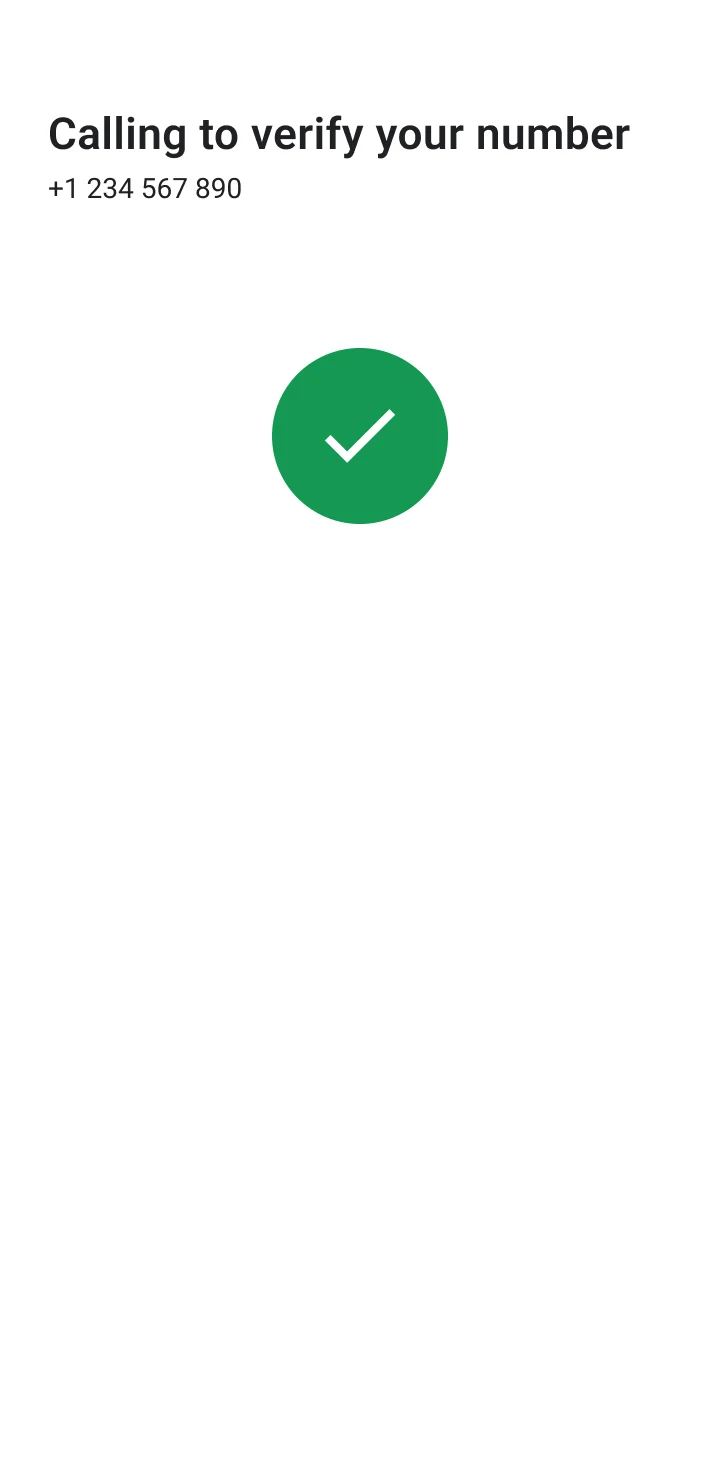
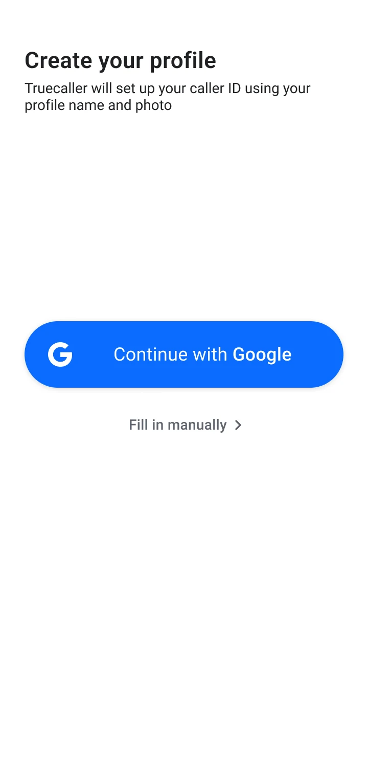
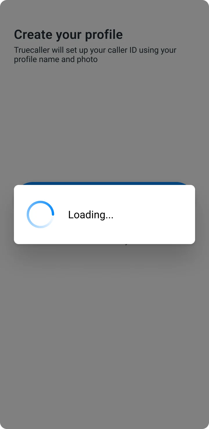
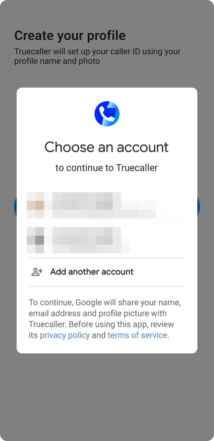
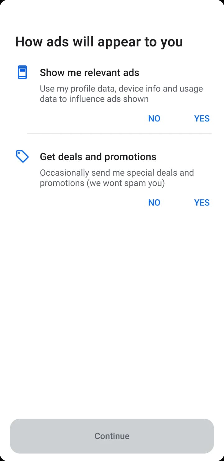
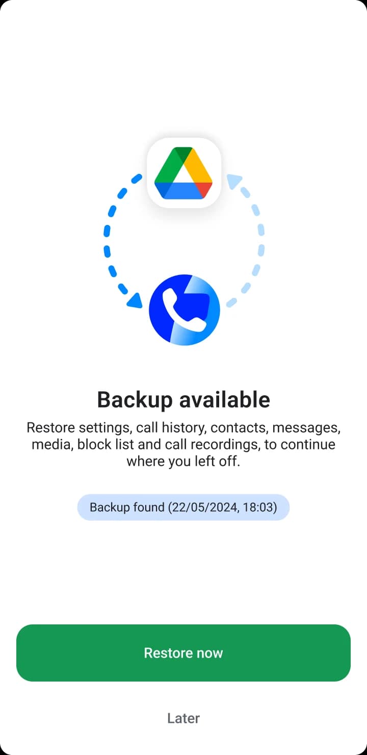
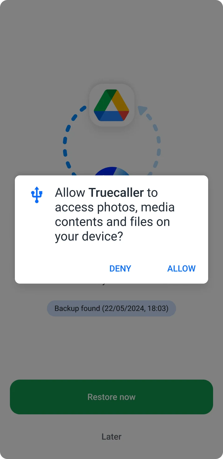
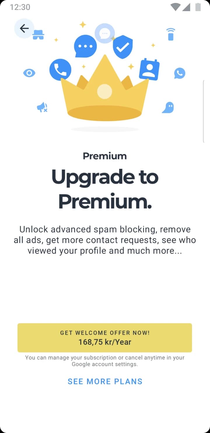
By the time the paywall arrives, people are in tap-to-finish mode. They do what they’ve done for the last twenty screens: tap past it.
So I looked at an onboarding that feels light. ShutEye, a sleep tracker, has twice as many screens, yet it feels shorter.
Every ShutEye screen asks about you: how you sleep, what you’d like to fix. It feels like progress, not paperwork. By the paywall, you’re already picturing a better night.
Length wasn’t the problem. Effort that doesn’t feel like progress was.
Hypothesis
If people name their own problem right before the paywall, Premium becomes the answer, not a feature list.
A short, deliberate pause. Ask a quick question, then show the feature that answers it. Internally we called it Project Sandpaper: friction, on purpose.
Only the end changed
I didn’t touch the setup. I took over the low-value screens right before the paywall and used them for three short questions.
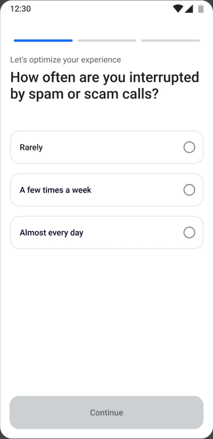
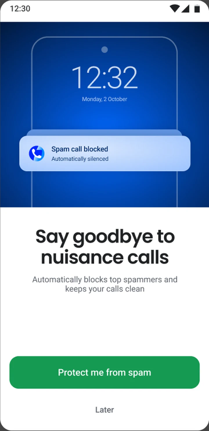
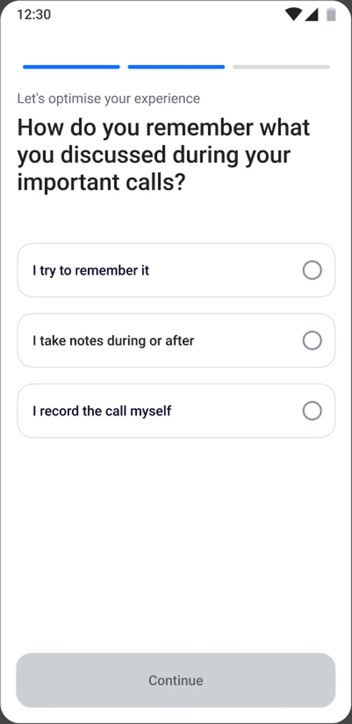
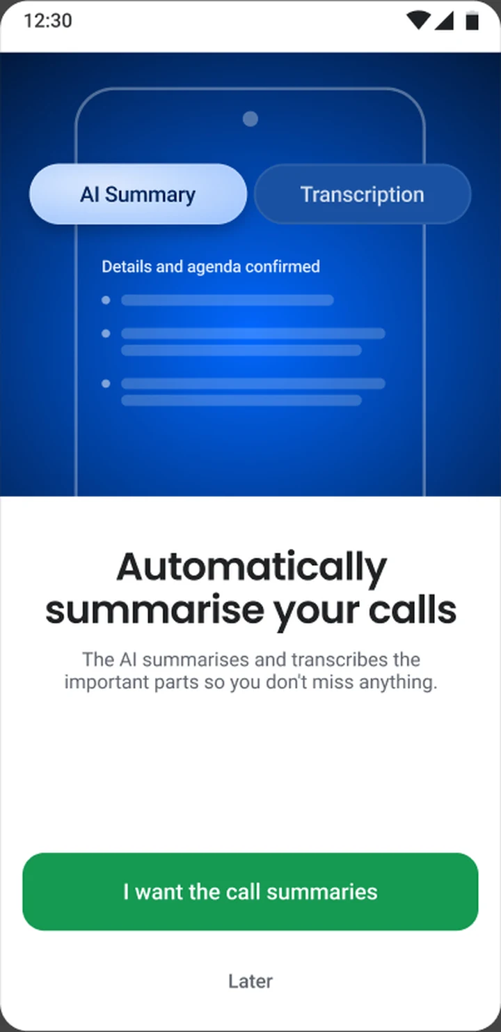
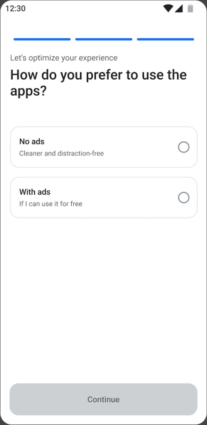
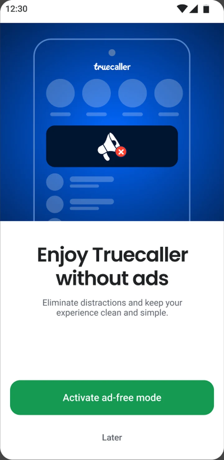
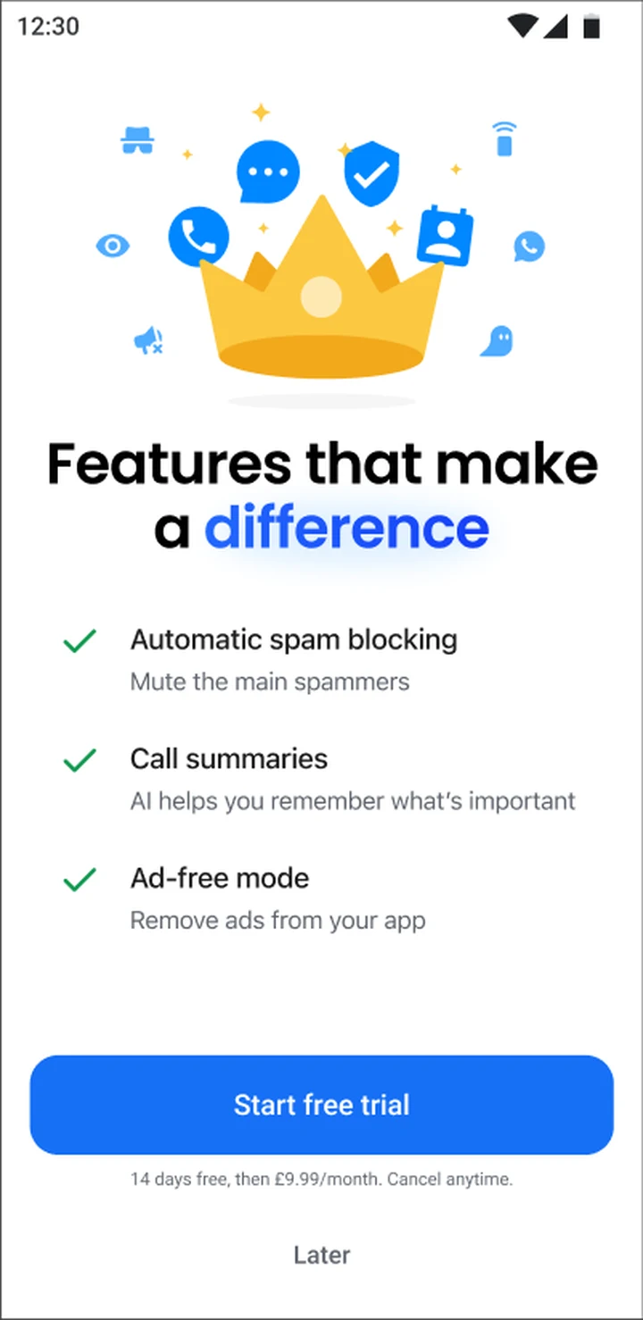
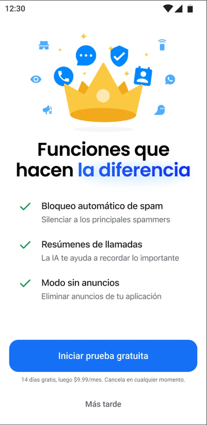
The paywall then repeats the same three features, now as solutions to things you just said. Getting it right took a few tries.
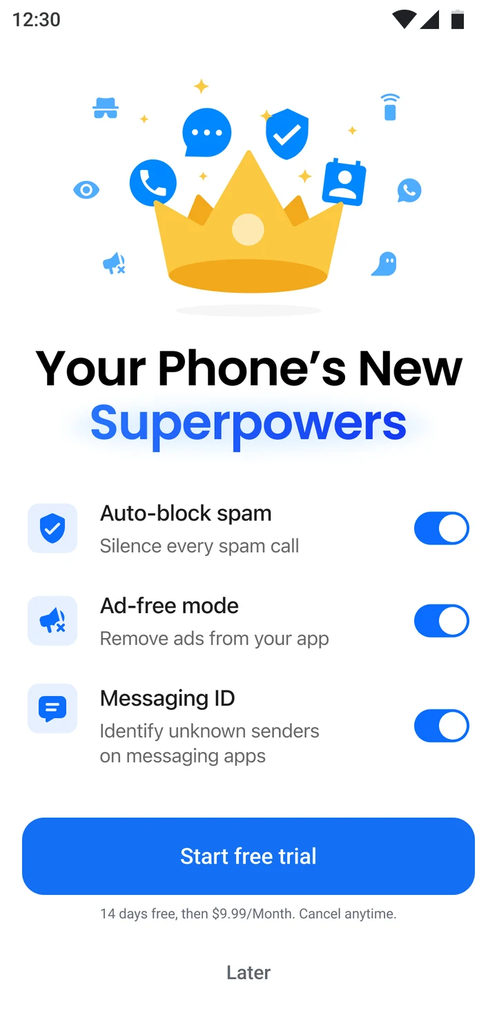
Toggles looked like settings.
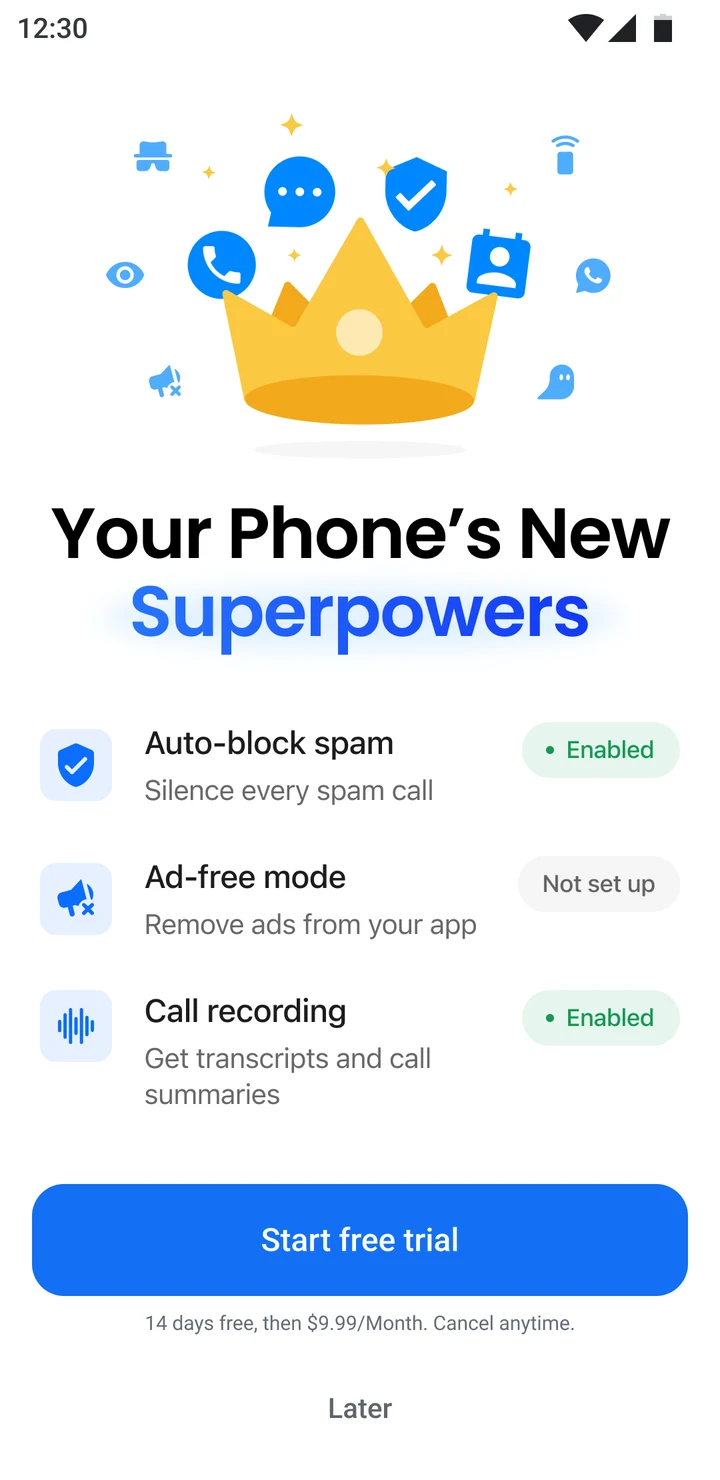
“Enabled” promised something before it was true.
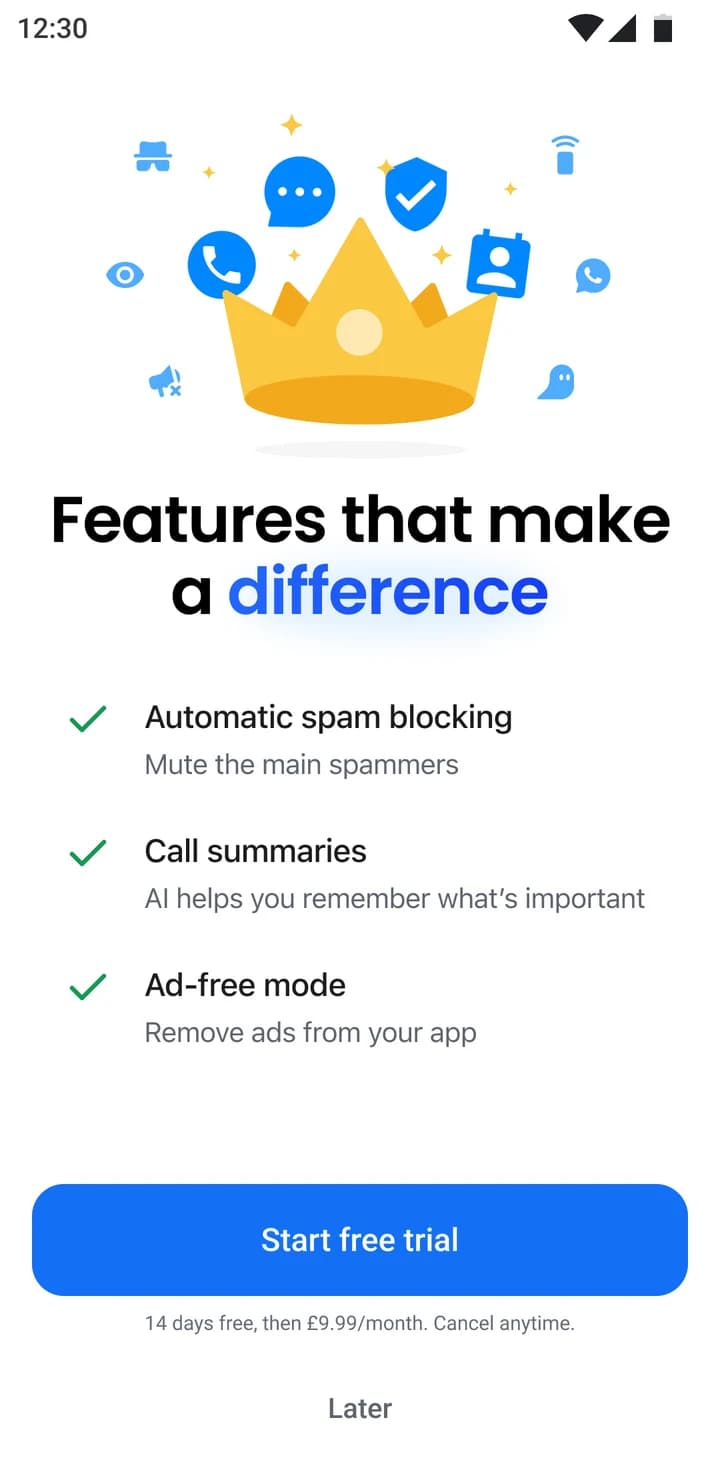
Checkmarks just say: included.
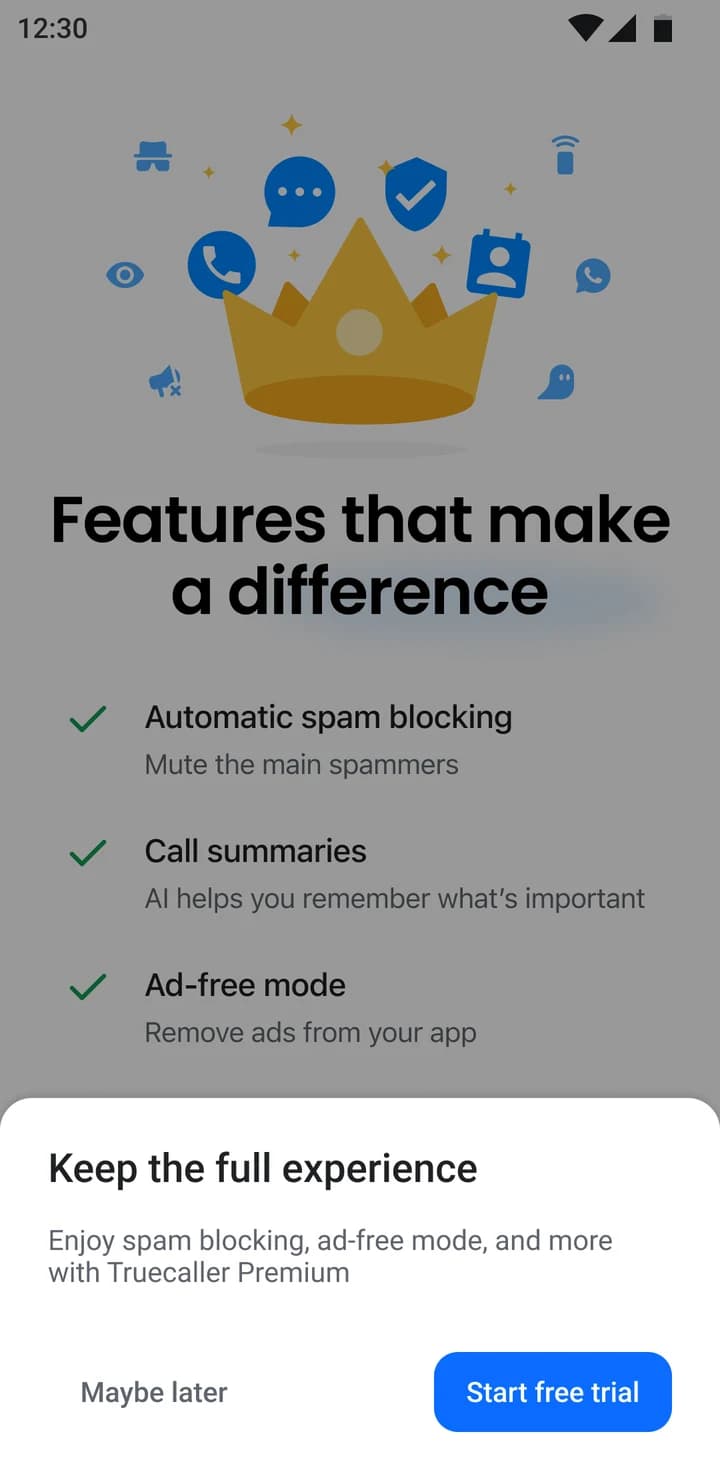
Tap “Later” and you get one last reminder of what you’d be keeping.
It shipped in Spanish. Longer words reshaped the spacing on every screen, and native speakers on the team reviewed the copy.
The test
We ran it live as an A/B test with ~53,000 new and returning users in Latin America, on Android, for two weeks. Each person was randomly given the old ending or the new one.
Same price, same trial, same setup. Only the moment before the paywall changed.
+73.7%
more people started a free trial
Uninstalls and deactivations stayed within safe limits, so the test ran its full two weeks.
Friction isn’t the enemy. A well-timed pause changes what people are ready to do next.
I also designed two other kinds of pause that haven’t been tested yet: one that lets you uncover each feature yourself, and one that leads with a feeling instead of a question.
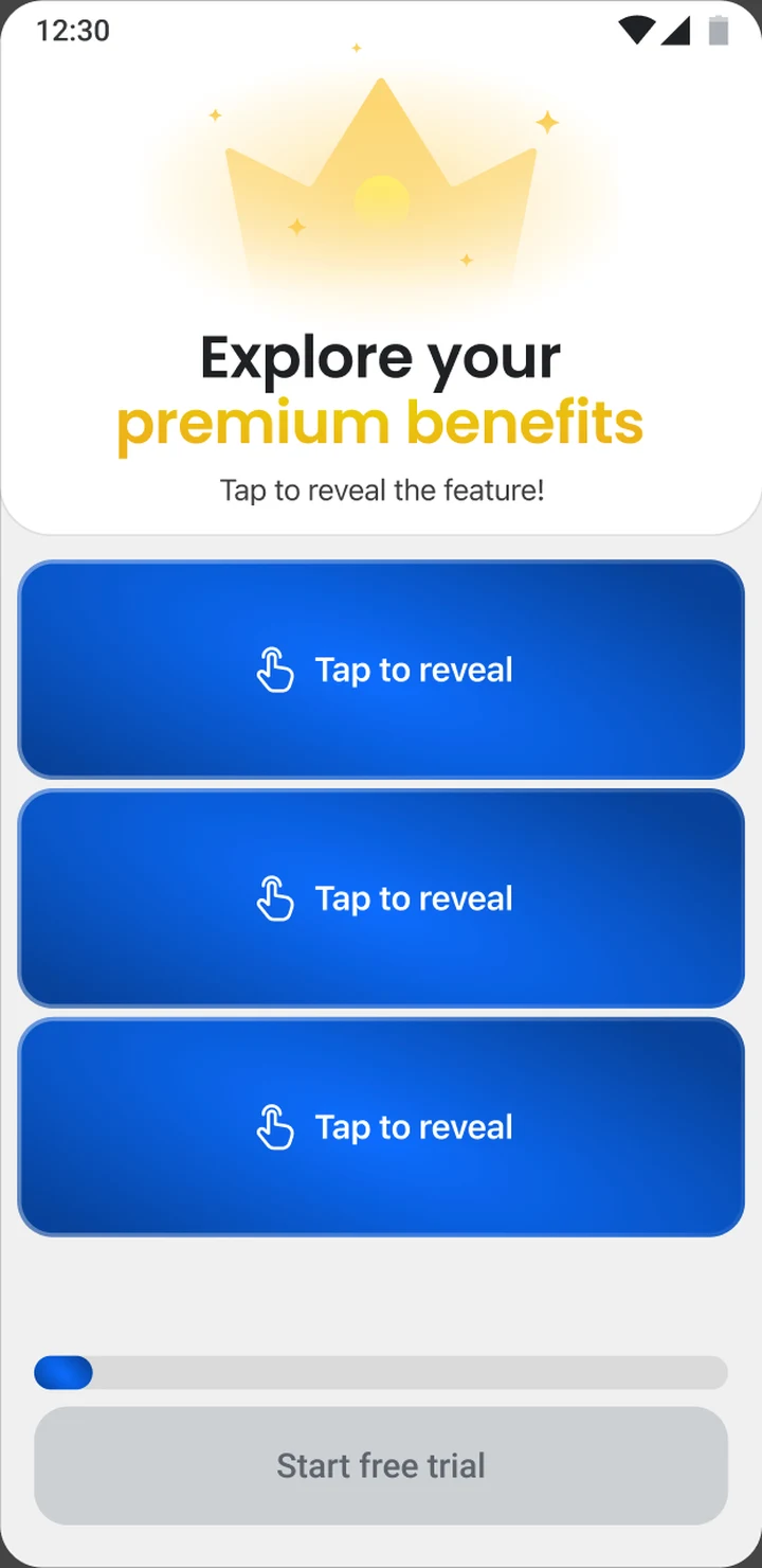
Tap to reveal each feature
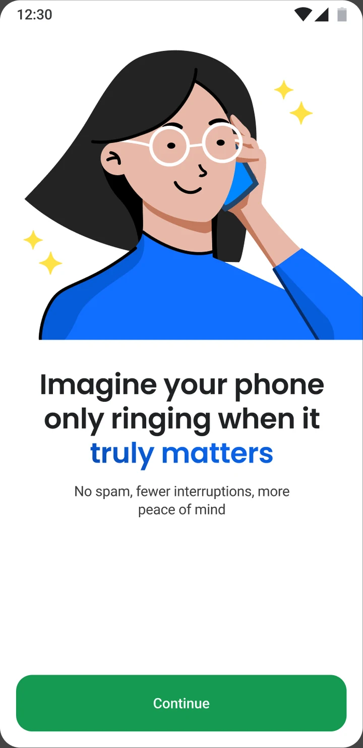
Lead with a feeling