
Turning Truecaller’s website into +800K app download clicks a month
The website has one job: get people into the app. Two places were letting them leave without it.
01
The hero is the first thing every visitor sees
+400K download clicks / month
The problemFour things kept people from the download
Before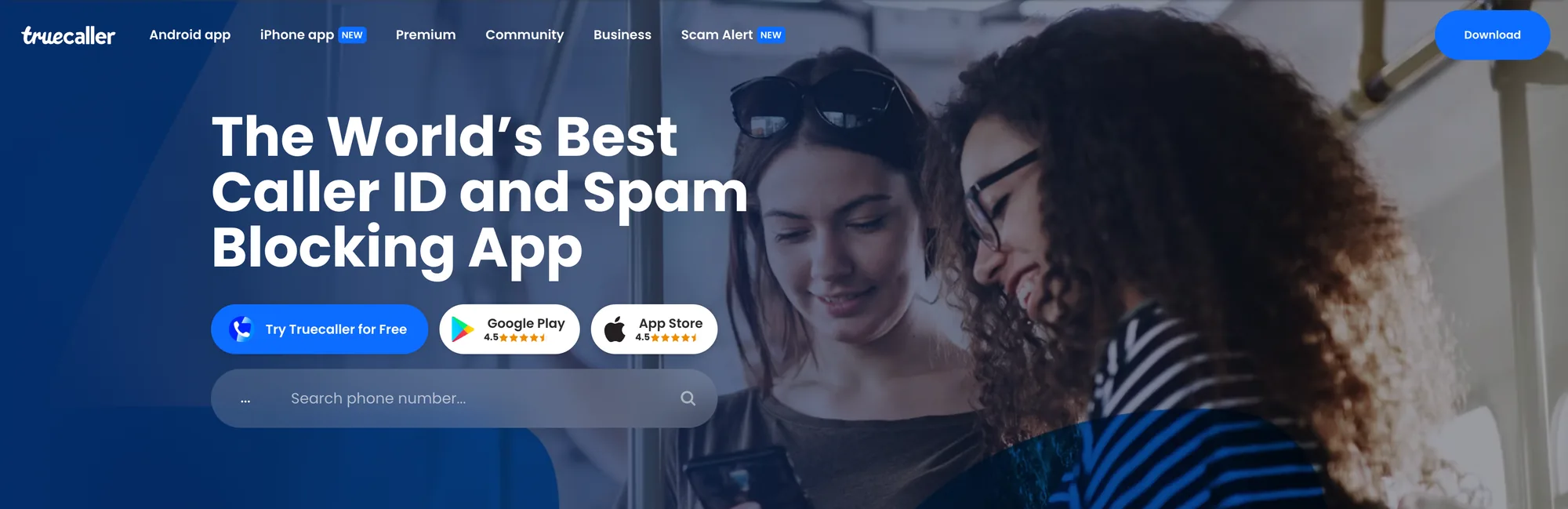
- Muddy background
- Crowded layout
- No social proof
- A search bar competing with the download buttons
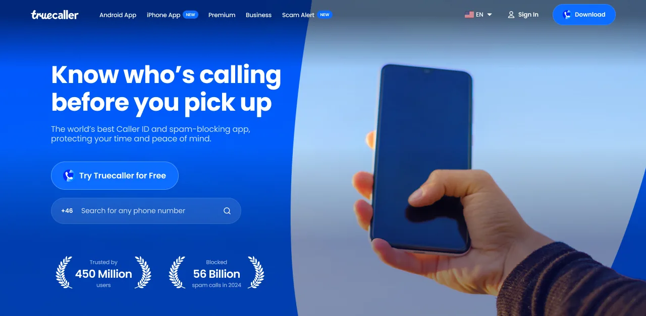
The redesignCalm, centred, and worth trusting
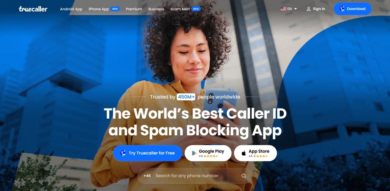
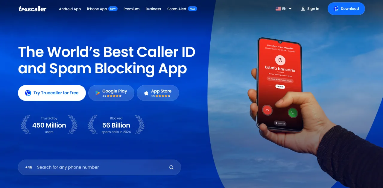
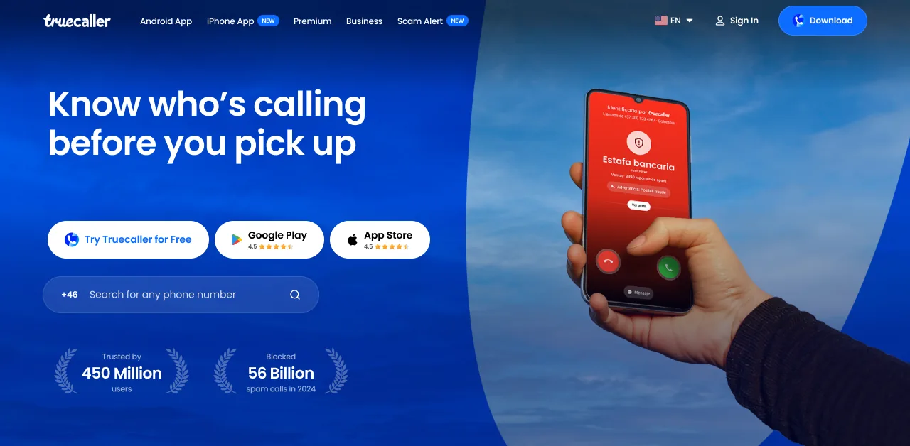
One photo, two gradientsThe bottom one carries the headline, the top one the nav

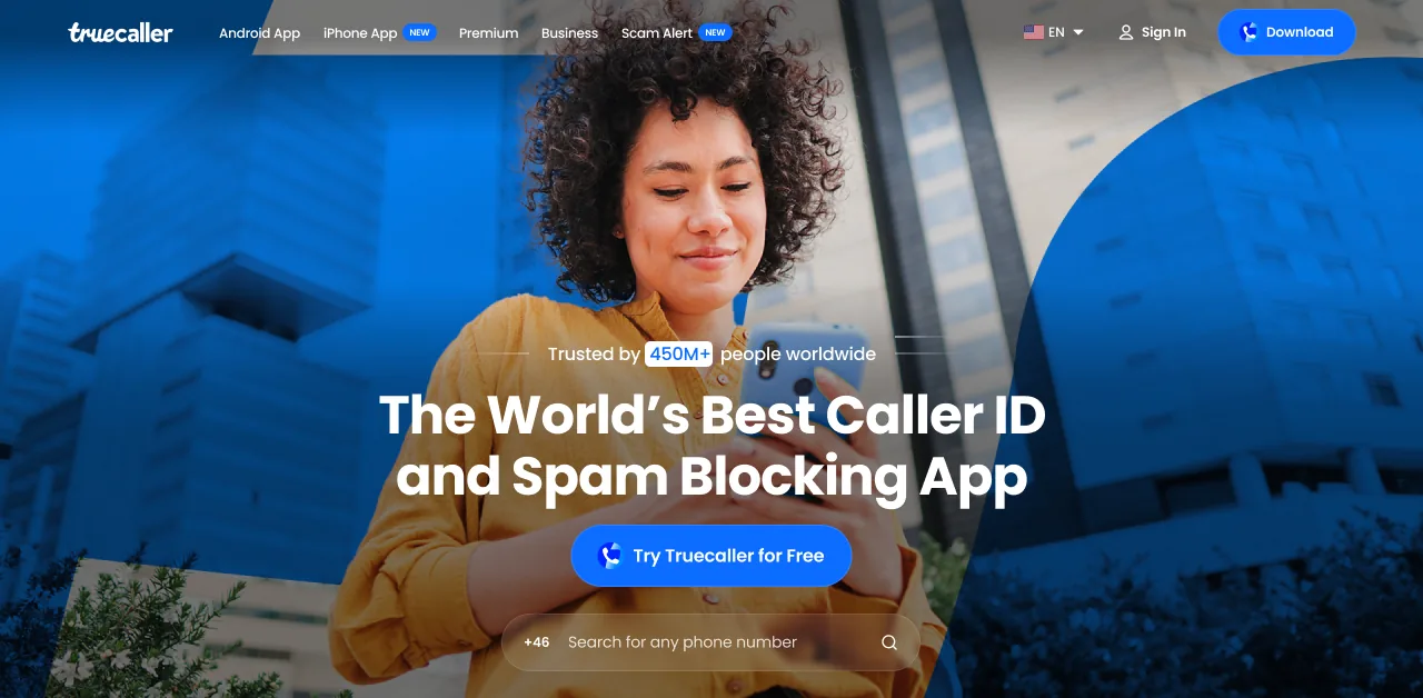
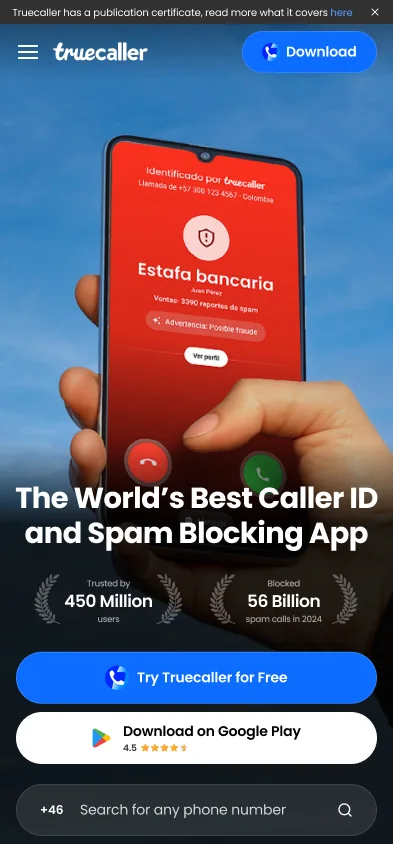
Three ways to download, one primary buttonWe tested which button leads, its colour and its position
Try Truecaller for Free leads in blue. Google Play and App Store follow in white, with their ratings.
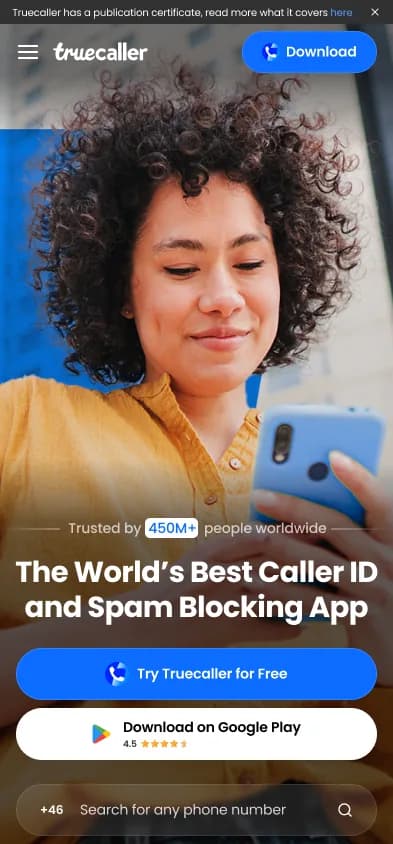
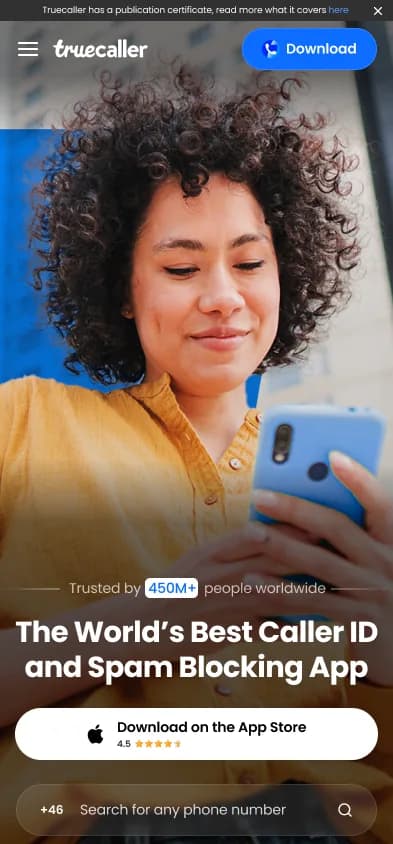
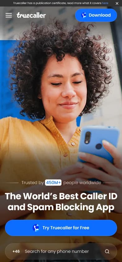
On phones, you only see your own store.
Also exploredProduct in hand, new headlines, laurels. The yellow shirt shipped
02
Sign‑in was where people already wanted something from the app
+400K download clicks / month
The insightPeople came to look up a number. Seeing the name needs sign‑in.And people defaulted to Google sign‑in
The ideaMake Truecaller the way to sign in. Then anyone without the app needs it, so Download comes first
The name comes back blurred. The app is what unblurs it.
A/B testedFive ways to ask. The first one shipped
Shipped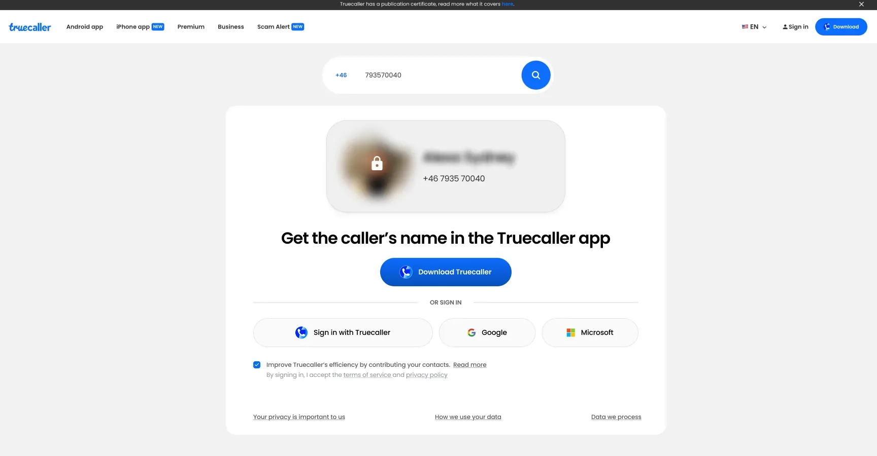
Download Truecaller leads. Truecaller, Google and Microsoft sign-in sit in one row under it.
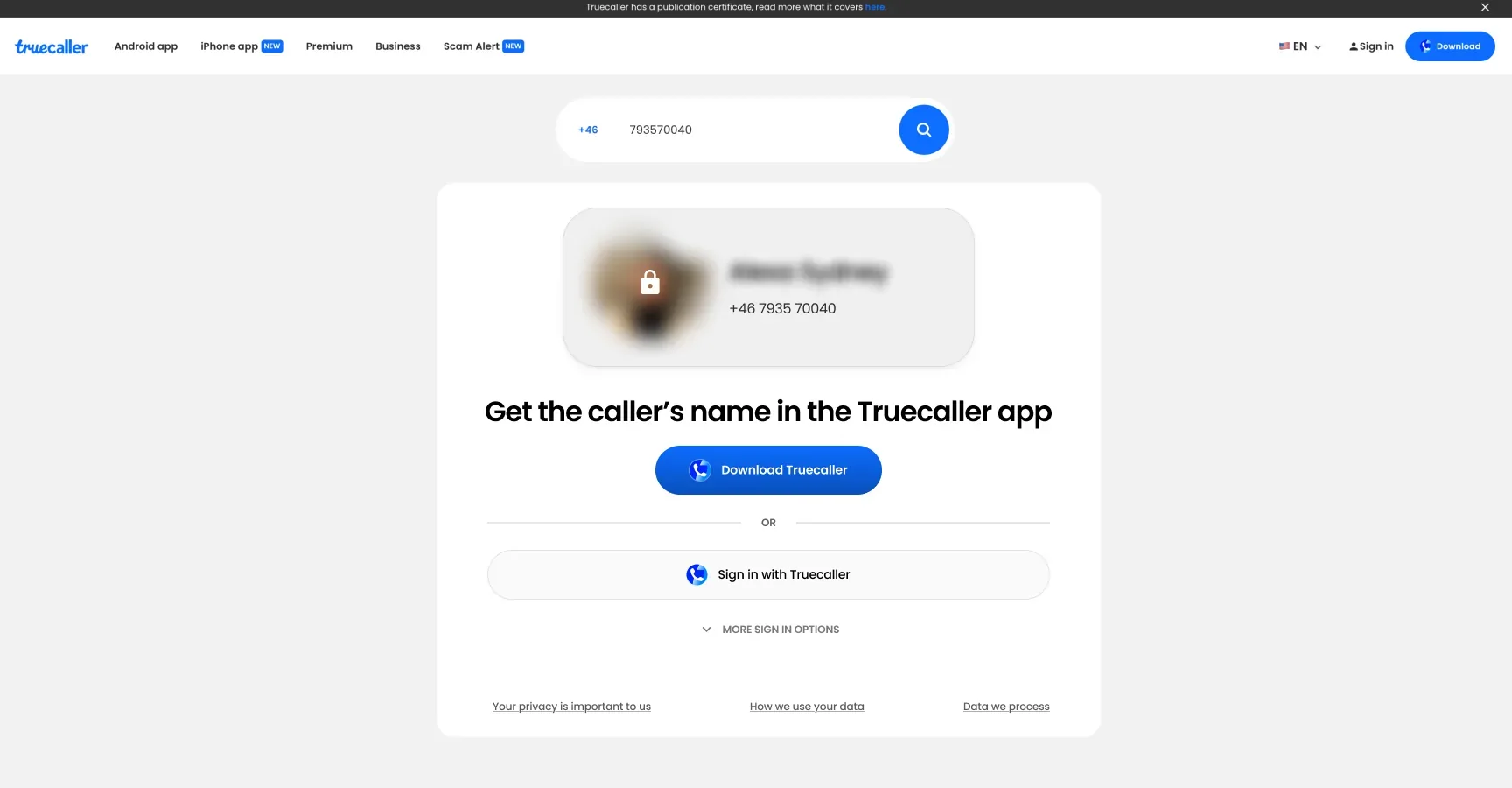
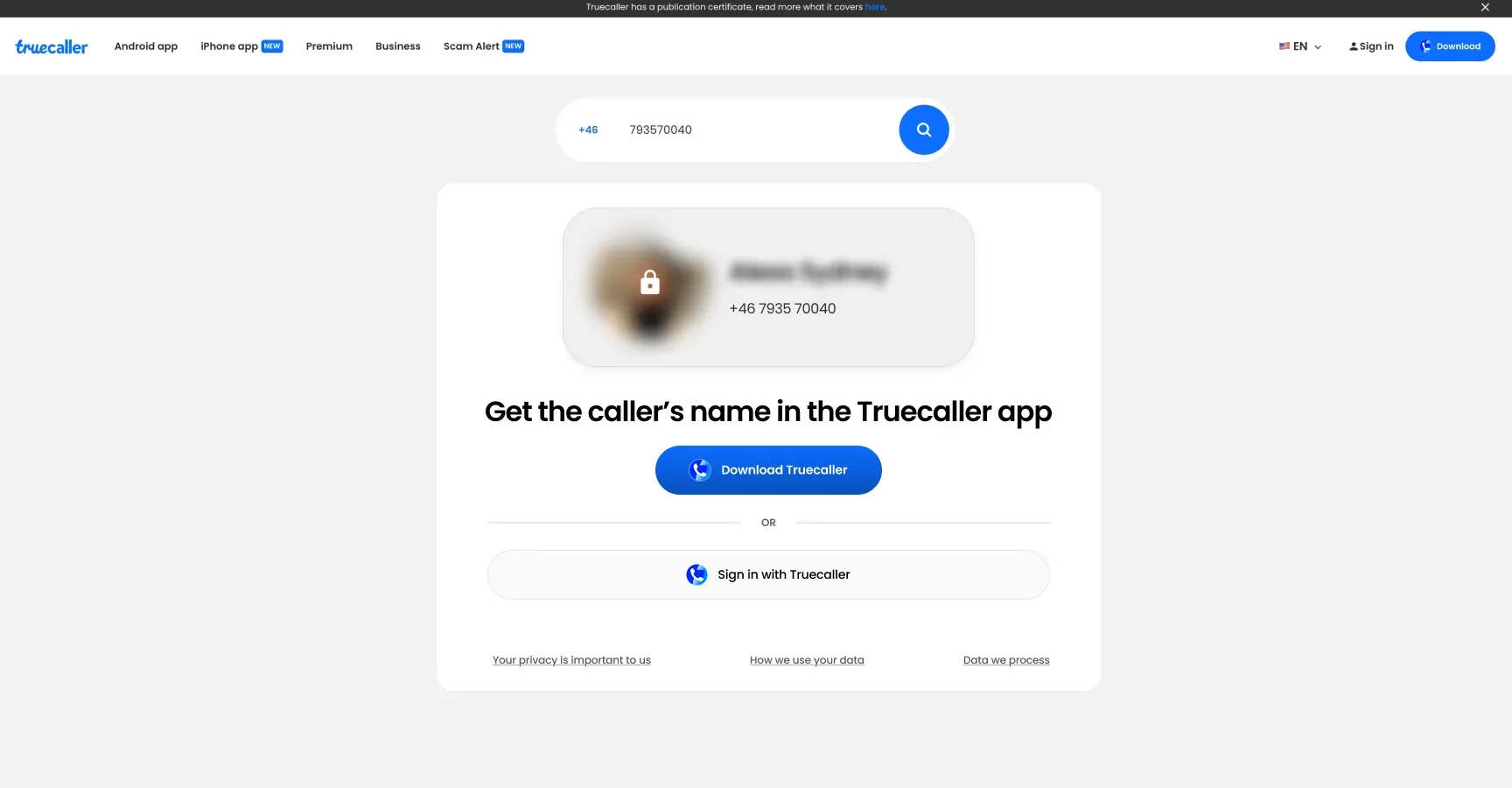
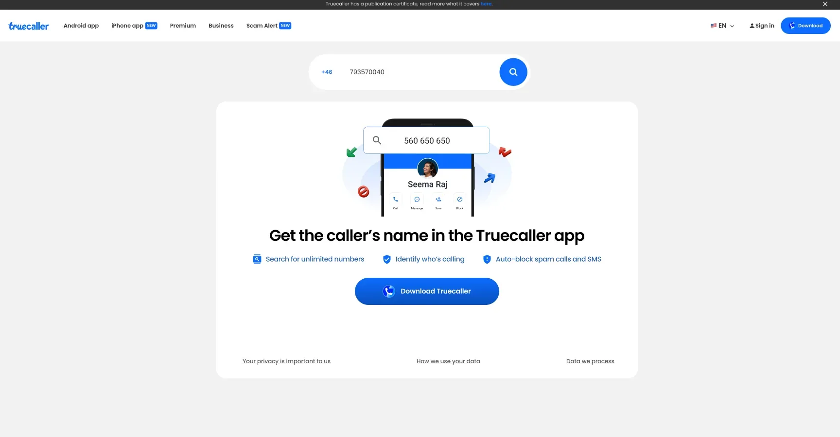
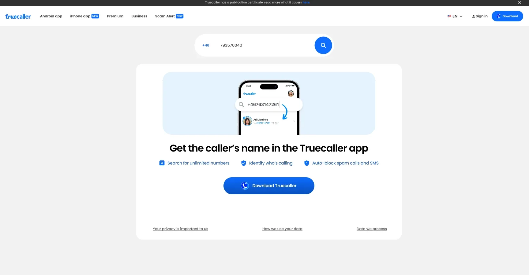
The same widget went into the sign-in modal and the number search screen. Number search drove most of it.
Outcome
+800K
app download clicks a month
- +400K01 · The hero
- +400K02 · Sign-in and number search